Curio is my final Honours project.
Design can document and curate artisan trades in order to celebrate and remind people of the value of artisan makers and their products.
Growing up in an age that us overwhelmingly digital, I often feel a sense of disconnection. I believe this is mirrored in the way we interact with our posessions, most of which have been mass-manufactured and are often viewed as disposable. This production process erases the humanistic aspect that artisan made objects possess. The appreciation and ownership of artisan crafted products, provides a sense of connection to something authentic. Artisan makers have often grown up around their craft, and the skills they possess are founded on decades of knowledge that has been added to, and passed on from generation to generation. This wisdom is then built in to the artefacts they create, along with the history, culture, passion and care of the artisan and their craft.
My honours project began with the belief that all humans have an inherent attraction to artisan made products. From century to century, artisan products have embedded themselves in history, from simply being a means to an end to being a sign of wealth, from a trade that heralded a movement to something that is now different and a 'one-off'.
Developed to highlight the value artisan trades have, Curio is a celebration of all artisan crafts. Each volume will document a region in New Zealand and the talent within these. Each artisan featured provides a personal reflection of their craft, their opinions and journeys, creating a collaborative visual diary.

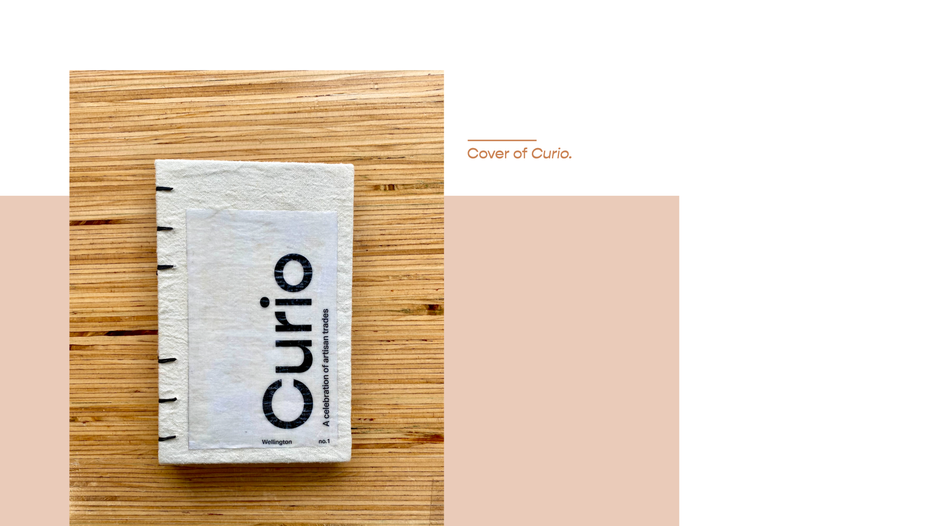


In order to represent my subject matter in a way that was reflective of the authenticity of the craft, I decided to create a publication. My initial idea was to create a zine and have each issue represent a region in New Zealand and the artisans within it. However, this didn’t feel it captured the care and attention that goes into artisan made products– the concept wasn’t special enough. This led me to the idea of a magazine/book hybrid- with the internal details of a magazine and printed in issues to represent each region. The first issue is based on Wellington. It has the exterior and quality of a book, making it more of a collectible, and something that is able to be beautifully displayed.
The initial Covid-19 lockdown influenced much of my research and solidified the direction I wanted to go in. It also got me thinking about how interviews were traditionally carried out. They involve a face to face conversation and generally a photoshoot. But what would happen if this face to face interaction couldn’t go ahead? Phone interviews, Zoom and FaceTime calls and photoshoots were all feasible options and were used by other publications during Covid-19, such as Vogue. However, these mediums wouldn’t allow me to get the quality of information and photography I wanted to curate a celebration of artisan trades. The second lockdown in early August confirmed that I needed to go in a direction that kept contact to a minimum or excluded it all together.
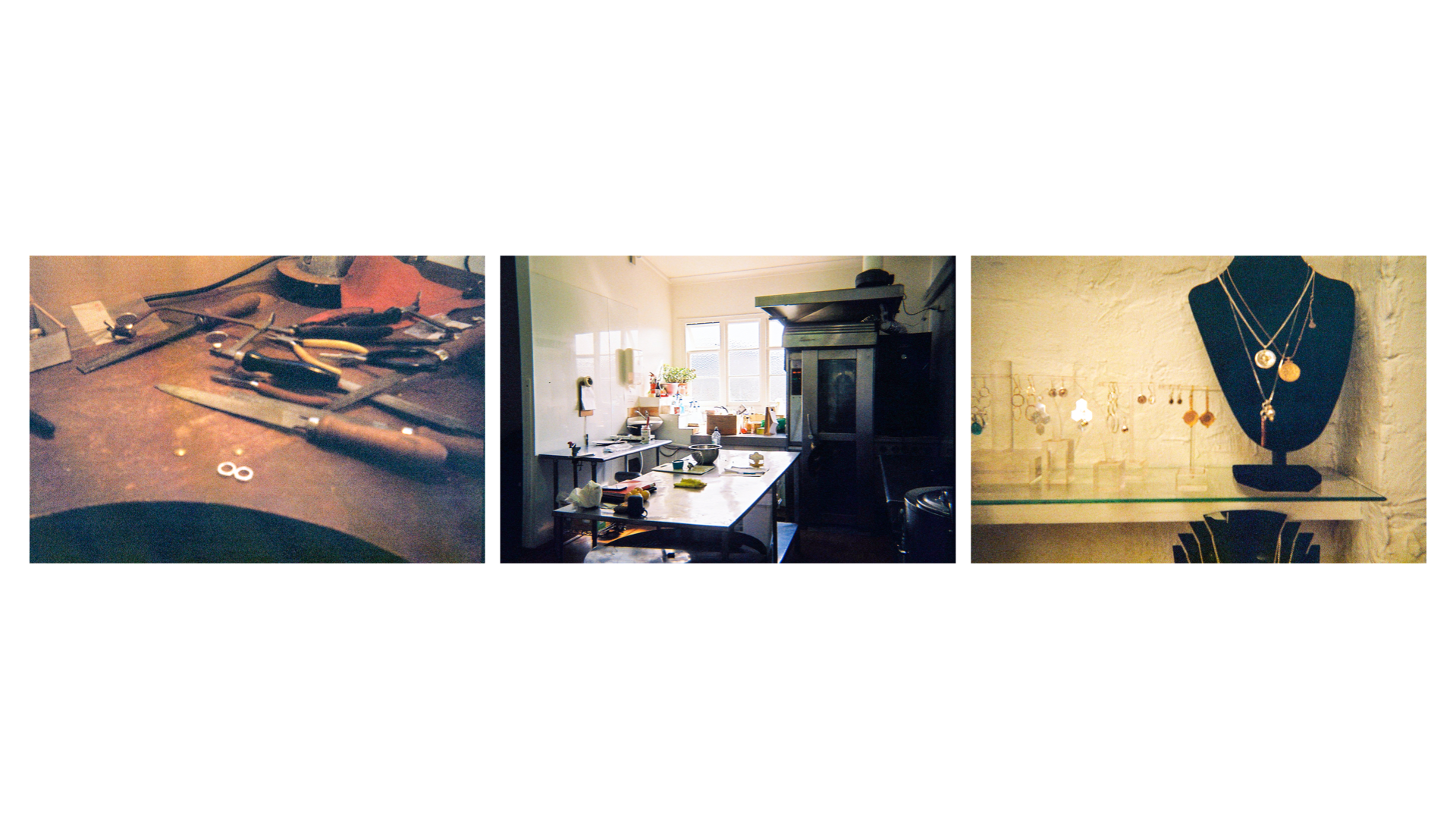
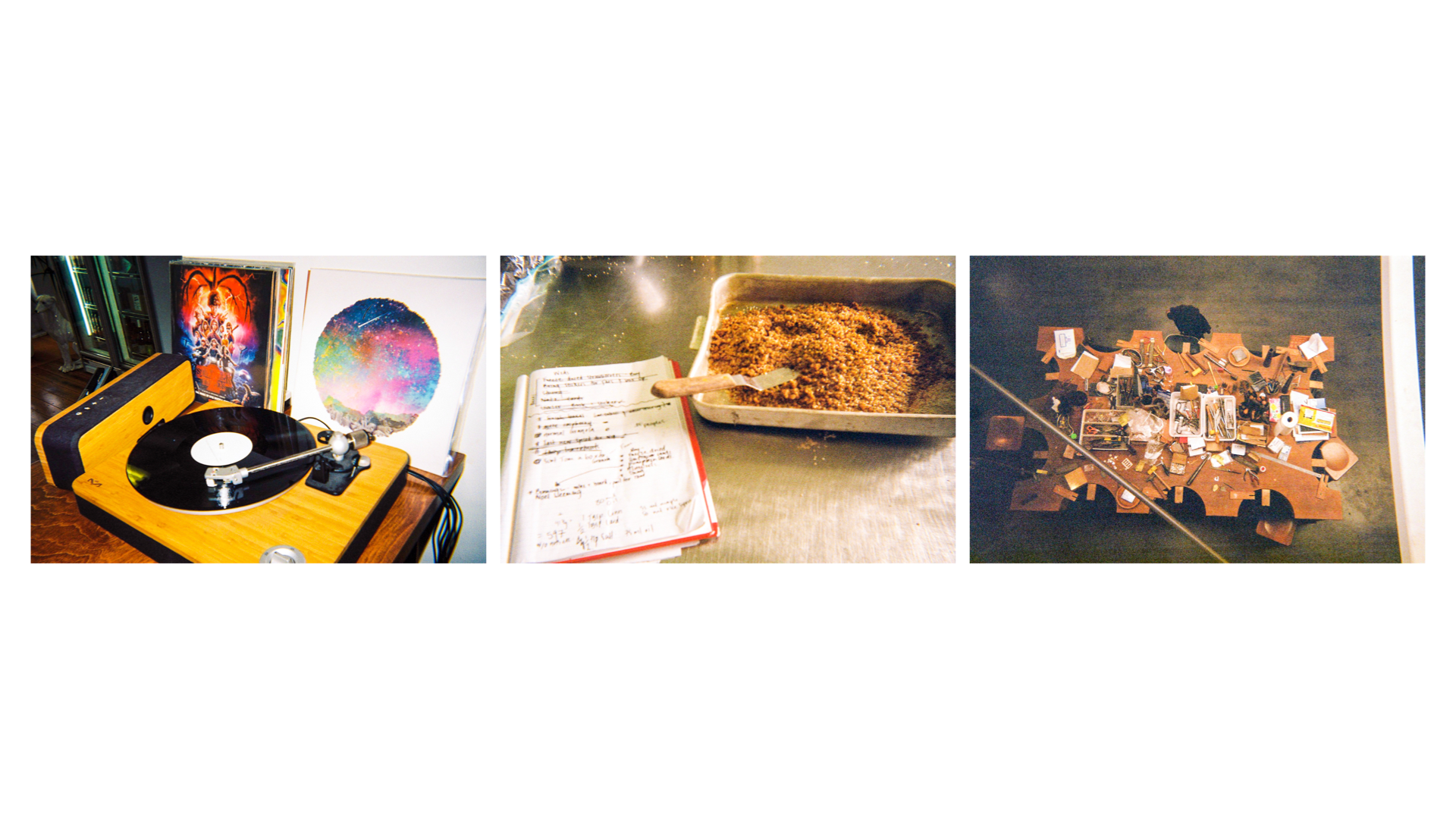
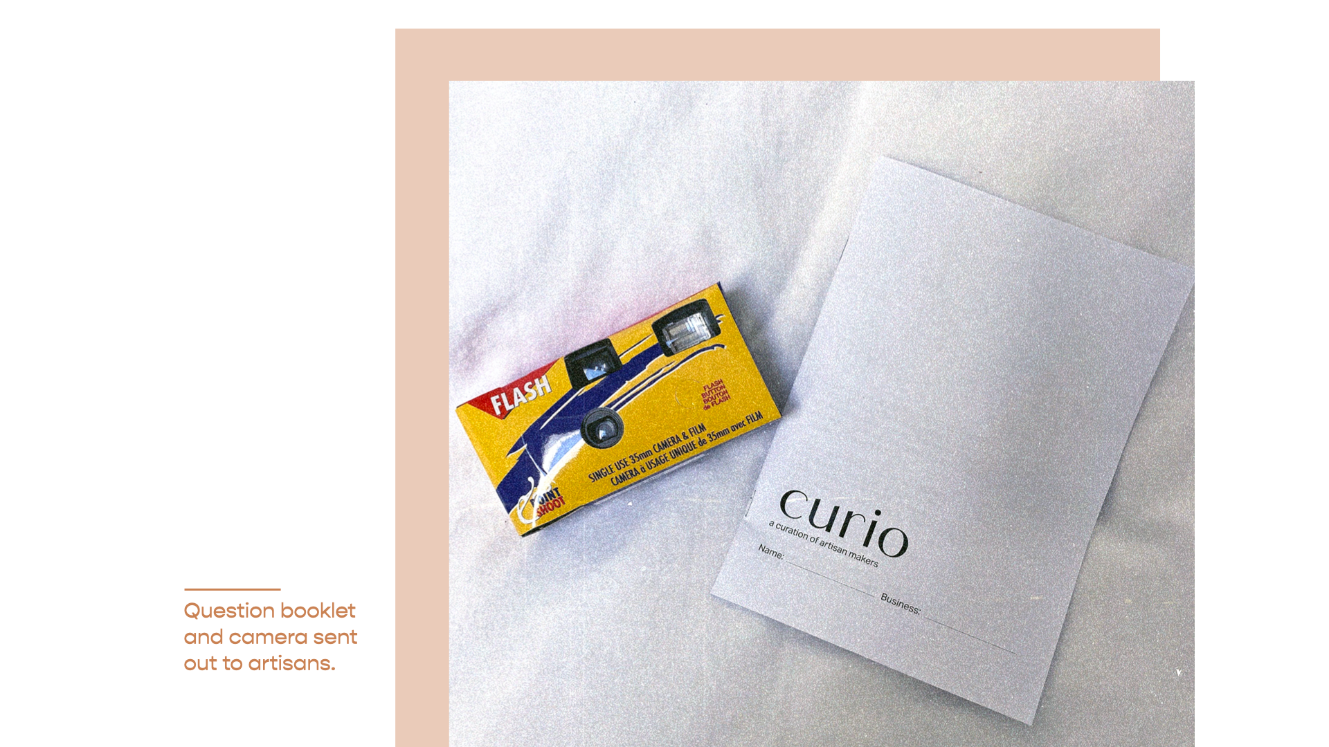
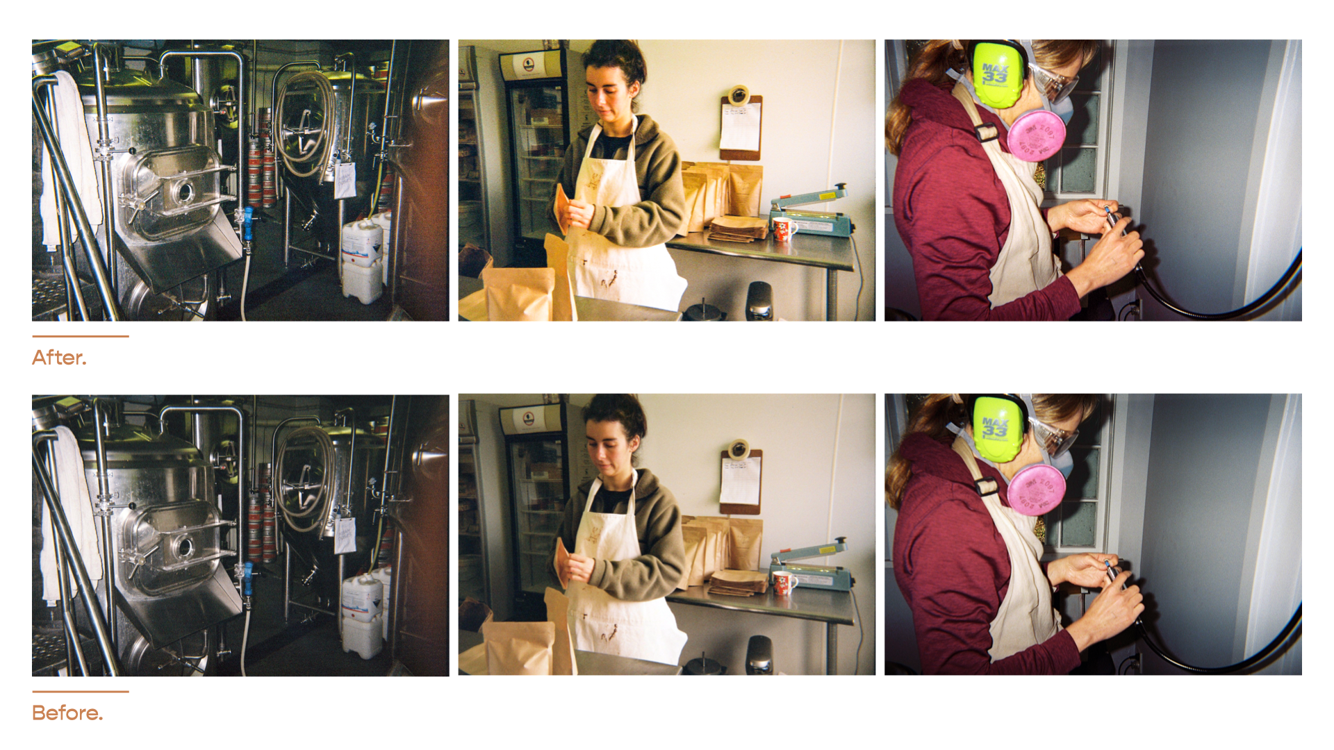
In order to achieve this, I created a broad set of questions and compiled them into a booklet with a brief and instructions on how to fill it out. The questions covered areas I would have touched on in a normal interview setting. Although I’m sure most of the artisans I approached have phones with cameras, I wanted to ensure the quality of images would be the same across all participants. The purpose of my project was to document artisan trades, most of which rely on analogue practices– this led me to disposable film cameras. The quality would be consistent, and my core ideas would be reflected. I sent the question booklet and camera out as a kit to eight artisans around Wellington and the wider suburbs. These artisans varied in trade from jewellers, ceramicists, brewers and distillers, to porridge and peanut butter makers, all enthusiastic about my project and what it stands for.
After my kits were dropped off, all I could do was wait in anticipation– would the responses be a little lack lustre? Would the images be blurry covered by a finger? Because the content for this publication relied completely on the contribution of my artisans, it could have gone very badly, very quickly. Luckily, this was not the case. The generosity of the responses delighted me. The detail each artisan went into was more than I expected, and more in-depth than from a traditional interview. This was the same for the photos.
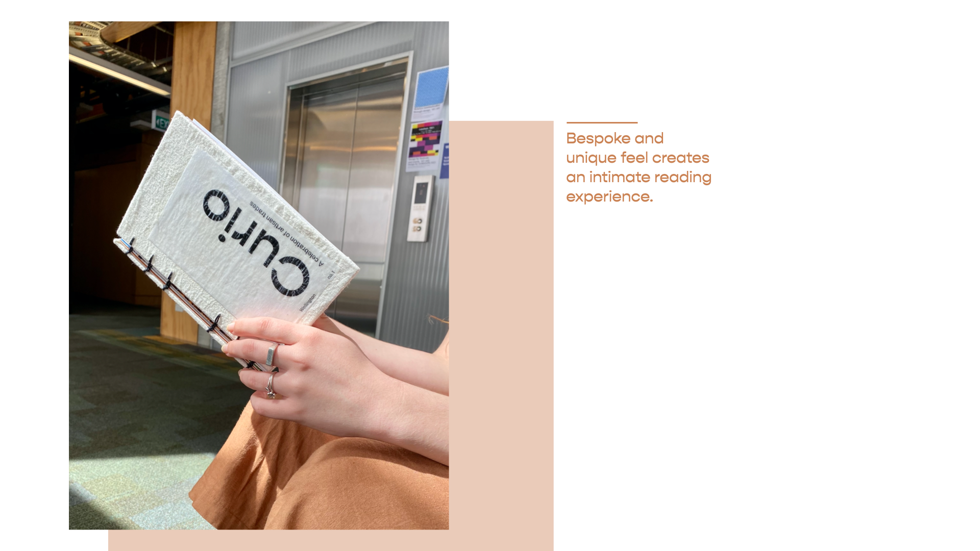
Curio is bound using coptic stitch and has a fabric hard cover. The paper stock used is off-white, recycled, and 110gsm to remain in keeping with the crafted aesthetic. I chose to print and bind the book myself as this lends itself to the craft aspect of this project. I held off on designing the content of the publication until I received the kits and had the film developed. The size of Curio is slightly shorter and narrower than A5, this creates a more bespoke and unique feel. It also means the reader has to get closer to the publication, making for a more intimate reading experience.
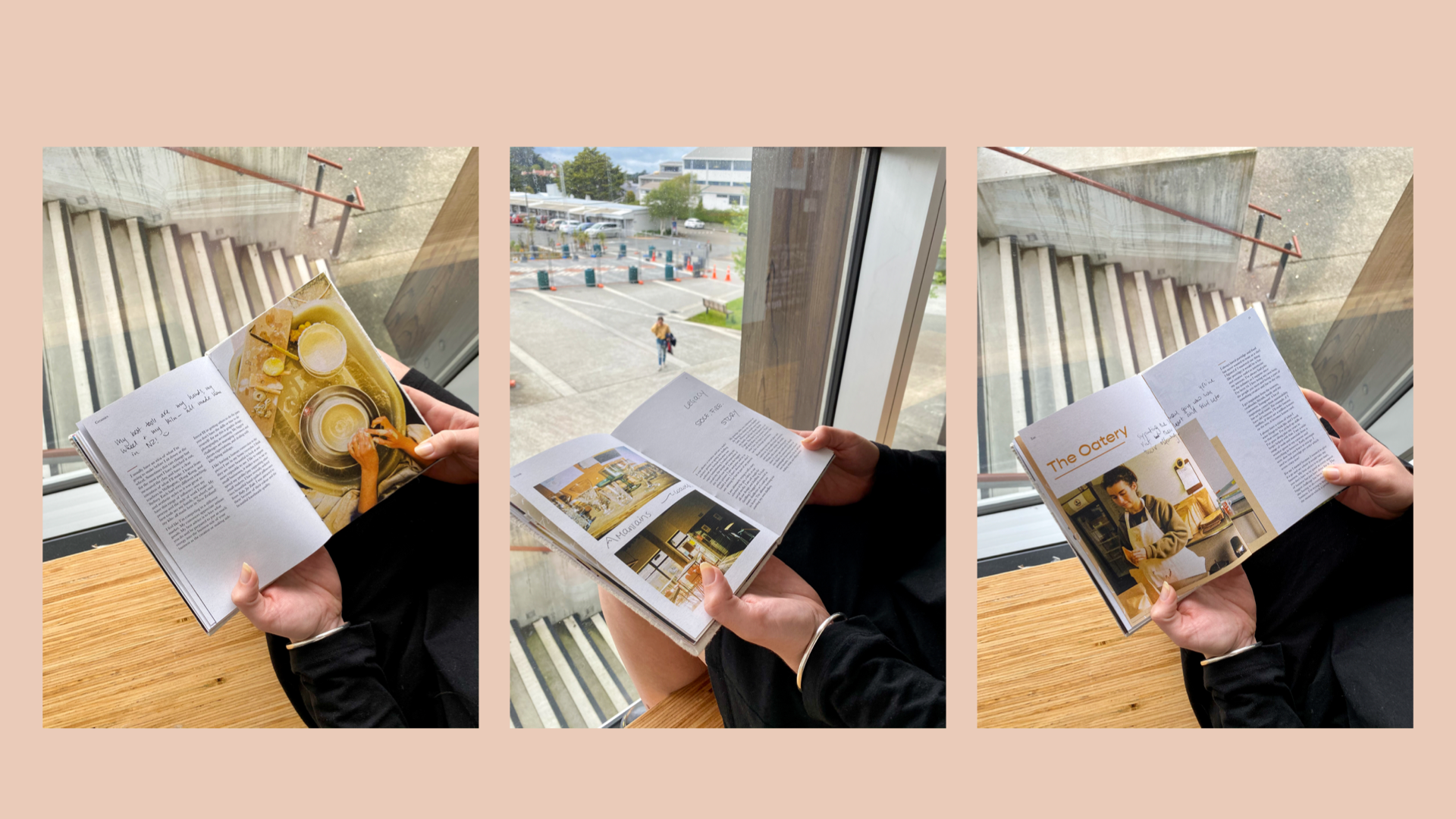
It was critical to the authenticity of this project that the tone of the responses and the images heavily influenced the design direction. For example, each artisan’s response was written by hand, allowing me to use their handwritten responses as pull quotes and to introduce the artisan. This waiting time also allowed me to concentrate on writing the introductory pages explaining the purpose of the publication and how it was made, as well as the history of artisanship.
I edited the images to create a cohesive look throughout the publication, despite them being taken by different people and in different settings.
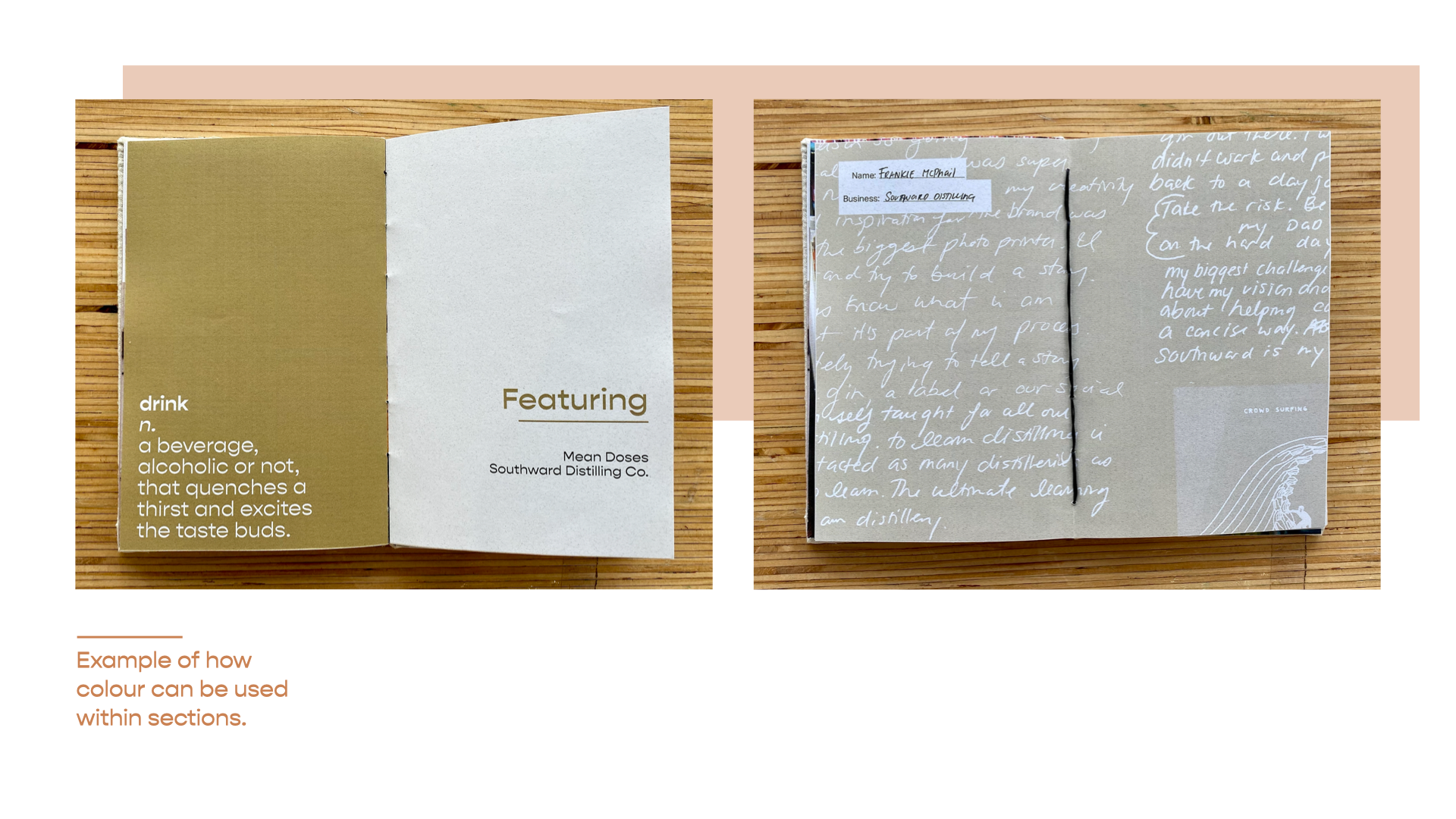
In order to add structure to my magazine I created sections for each type of artisan trade, for example, jewellery, eat, and drink. These are signalled by a change in colour, a definition of each trade and the artisans featured in each section.
To make the sections a more apparent and purposeful feature, I dedicated a colour to each. The colours selected are pulled from the images featured in each section, and therefore complement the overall tone. Even though these colours were dictated by the Wellington issue, I intend for these same colours to be used across all issues to create continuity. I believe that regardless of the images, the colours I have identified will work for the respective sections. This is because the sections that have multiple artisans featured in the Wellington issue such as drink and jewellery all complement the selected colour. The colours at 100% opacity have been used on full pages, the main headings and pull quotes. At a lower opacity (42%), they have also been used to introduce each artisan and as an accent on some of the spreads.